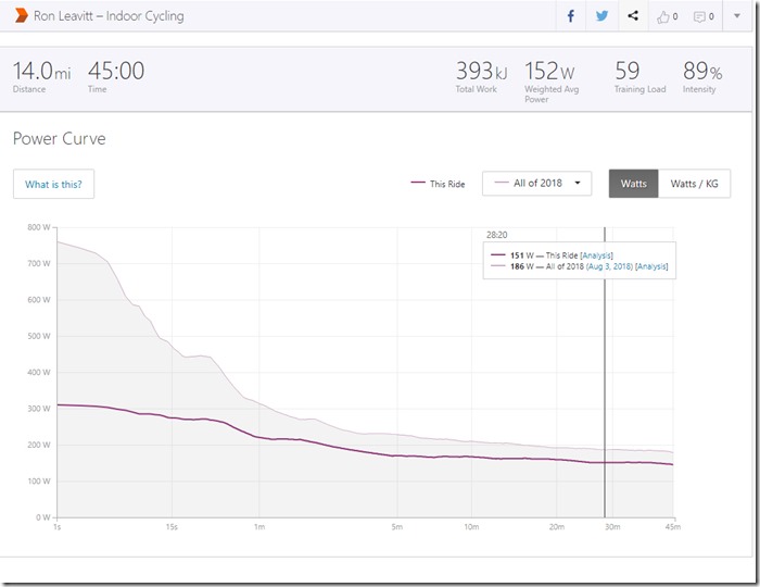
Power Curve Today vs Best of 2018
Peloton
Today I took an on demand hip-hop ride with Robin Arzon On Demand. I felt really sluggish during the warm up. My legs did not want to move. There were 63 other riders taking the ride. After the first few minutes things got better, legs warmed up, more resistance felt good. I noticed that I was four or five point of output behind the next person on the leaderboard. The next past her (30’s female) was another 8 higher. Cool, targets! That motivated me through the ride. Next up, 6 points ahead let’s get ‘em. As time went on most of the “riders” on the leader board had finished (there’s a progress circle that shows percentage completed). They were easy to surpass. There was a 20 year old and a 30 year old who held on for a while, then dropped back. However, this one 50 year old woman who had started after me was keeping pace ahead, though at a different point in the ride. After a while I hit a push, caught up, and passed her. As I passed riders who had finished, she dropped off the bottom of my limited leader board view. Minutes later, she climbed back, passed me, and dropped out of sight at the top of my limited leader board view. Aw Shucks. I kept plodding along (working hard) passing mostly finished riders and the occasional 30 something woman until Ms 50 yr old re-appeared atop the leader board. I was closing on her or at least there were no riders whose output was between mine and hers. I put it “in gear” and she did as well. A few minutes later she disappeared not to be seen again. I gave her a high five before she disappeared. (high five is a social gesture you can give by pushing on a rider’s leader board icon.) No high five back? Not uncommon.
What was surprising and a bit disappointing was my total output: 394 kj. I was pushing past “all these people” on the leader board and finished like #6 of 63, pretty good I thought. But my best 45 minute output (my PR) is 486! 92 more than on this ride, a 23% difference! Twenty Three Percent!?!
This is one reason tracking performance is a good idea. A ride’s output doesn’t lie. I felt like this was a very high performance ride and it was not. It’s far from my best. Am I disappointed? If I compared raw outputs I could be, but looking at the overall plots of my 45 minute rides, both the average output and overall output fall above the trend line. This was a better than average ride. No complaints here!
The power curve image at the top of the page compares today’s output against the best output for any and all rides in 2018 for a period of time. The example shows comparative output for a 28 minute 20 second window. My best output, 186 kj, was on August 3rd. Today’s 28:20 output was a measly 151 kj. Strava.com provides this breakdown and other statistics. I’ve setup Peloton.com to directly feed ride measurements to Strava.com. Strava.com directly feeds myvirtualmission.com to track cumulative mileage on virtual missions. Strave.com also feeds mPaceLine, a performance tracking app for smart phones. All these data intensive tracking applications take the guesswork out of athletic improvement over time. It’s pretty cool if you’re a data nerd.

